- Problem
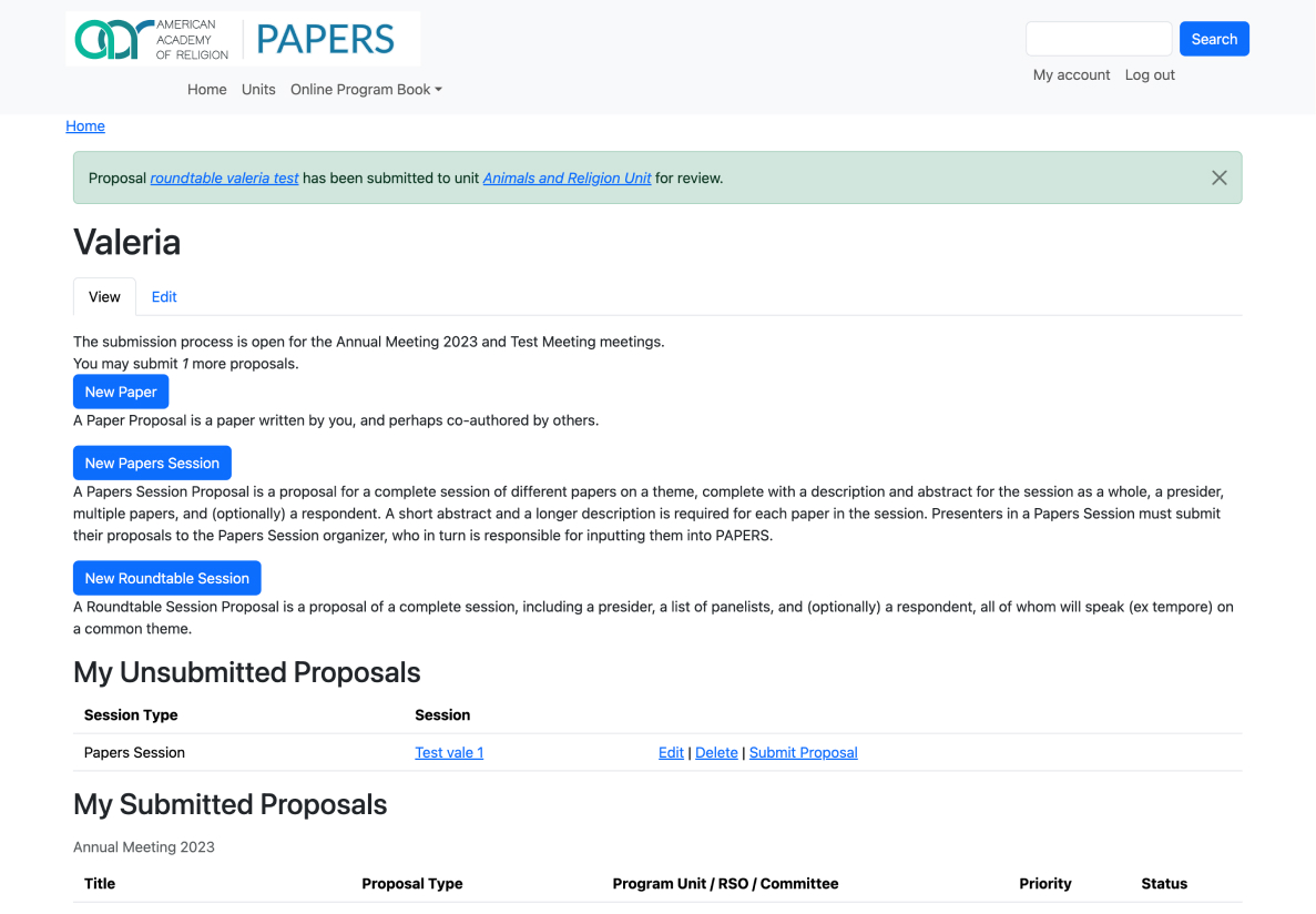
- PAPERS worked, but it read like unstyled defaults: stacked buttons, long paragraphs and plain tables, and its architecture could not change.
- Solution
- A redesign inside Bootstrap 5 that reorganizes and restyles what was already there, focused on the submission flow and adapted to mobile.
- My role
- UX/UI Designer at 10 Grounds.
- Skills
- UX/UI designRedesignDesign systemBootstrap 5Responsive
- Methodology
- Audit of the existing screens, then the submission flow first, restyling Bootstrap 5 components, and finally every screen adapted to mobile.
PAPERS is the system scholars use to submit paper and session proposals to the meetings of the American Academy of Religion. The brief was to improve the experience on a short timeline and with little room for design complexity.
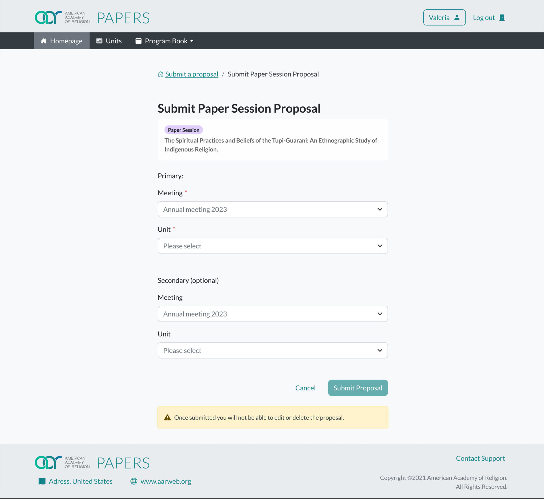
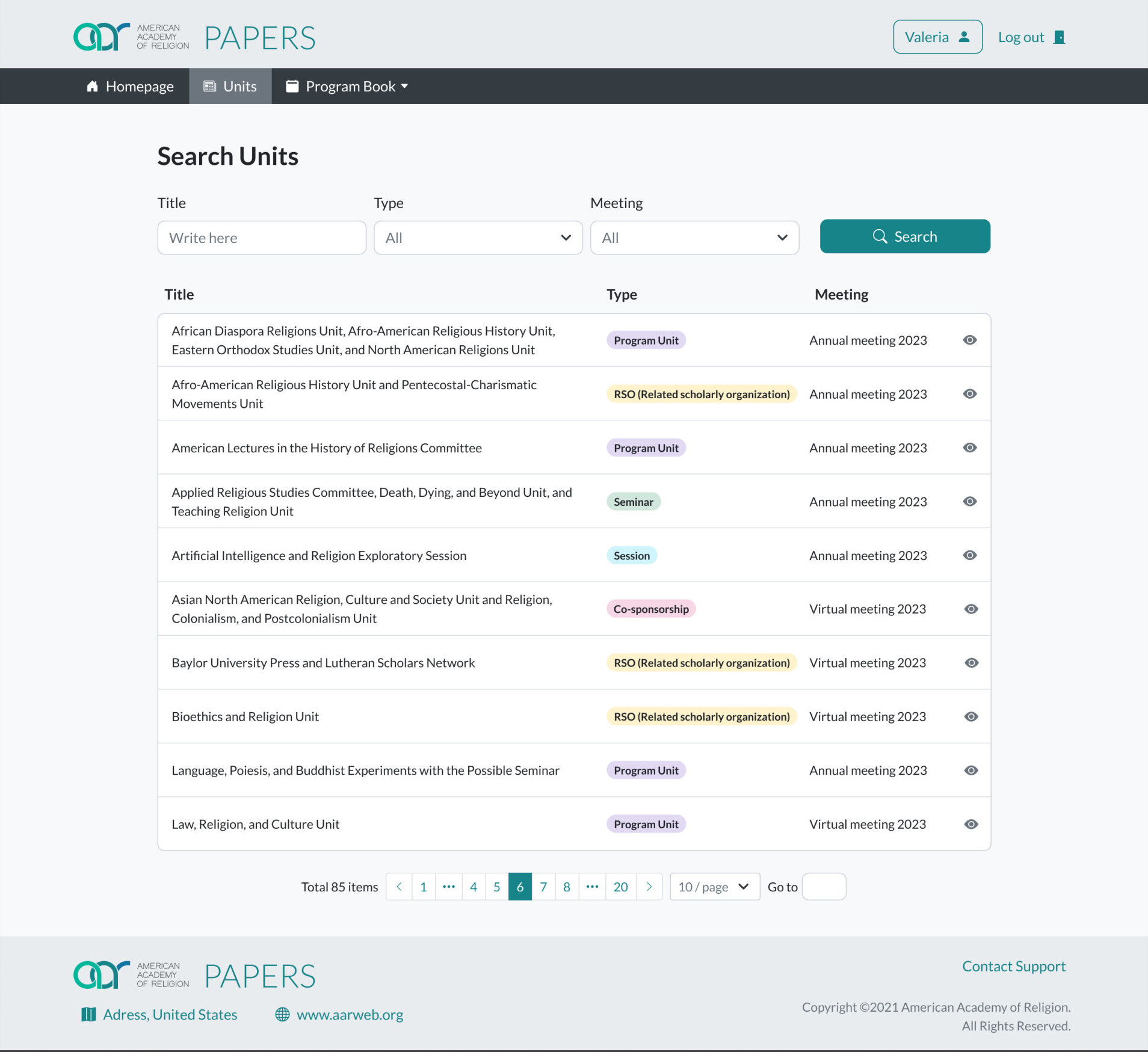
The work covers both sides of the system: the people who submit proposals, and the chairs and steering committees who receive them. It runs through the flows to create a paper, a papers session or a roundtable, submit a proposal and search program units.
Choose first
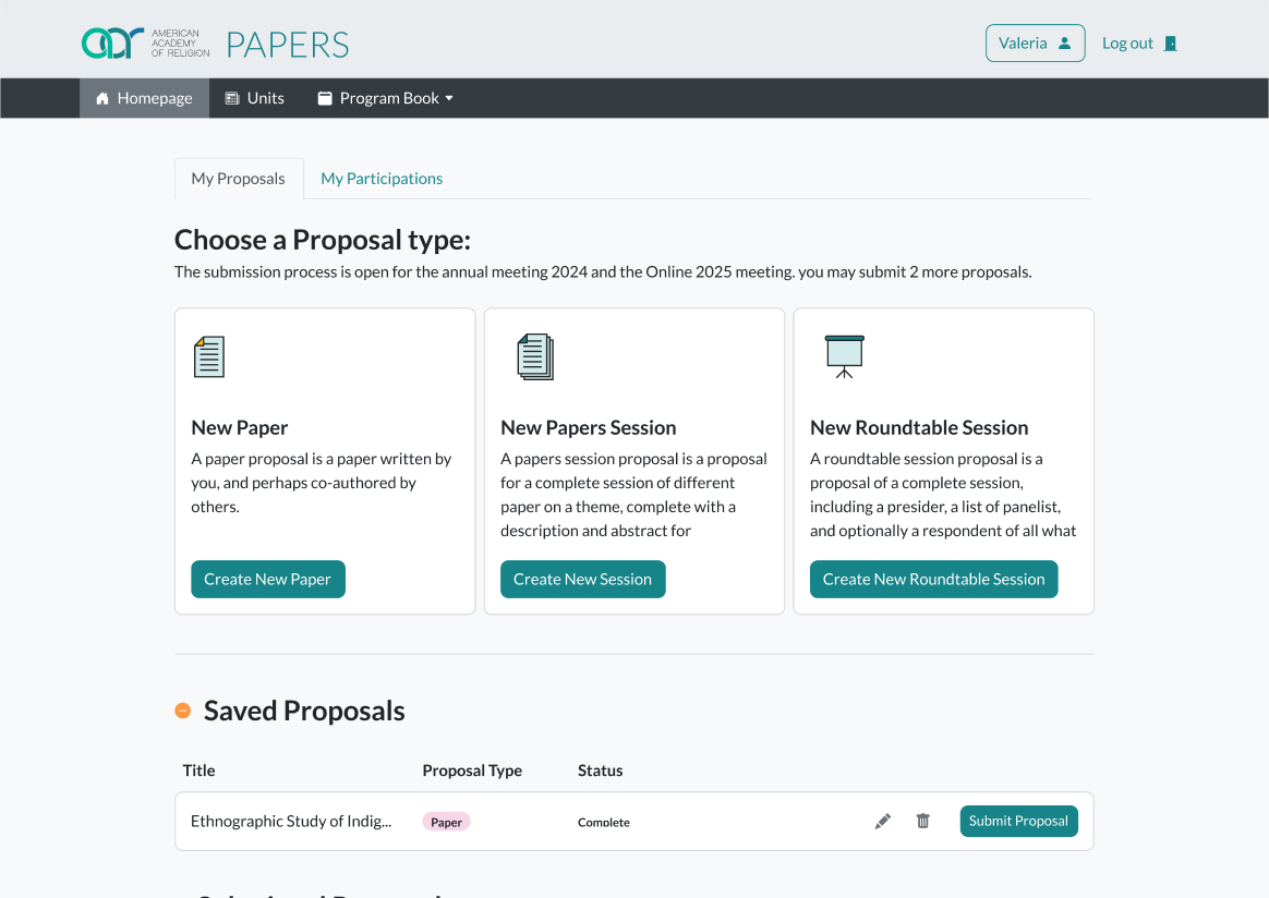
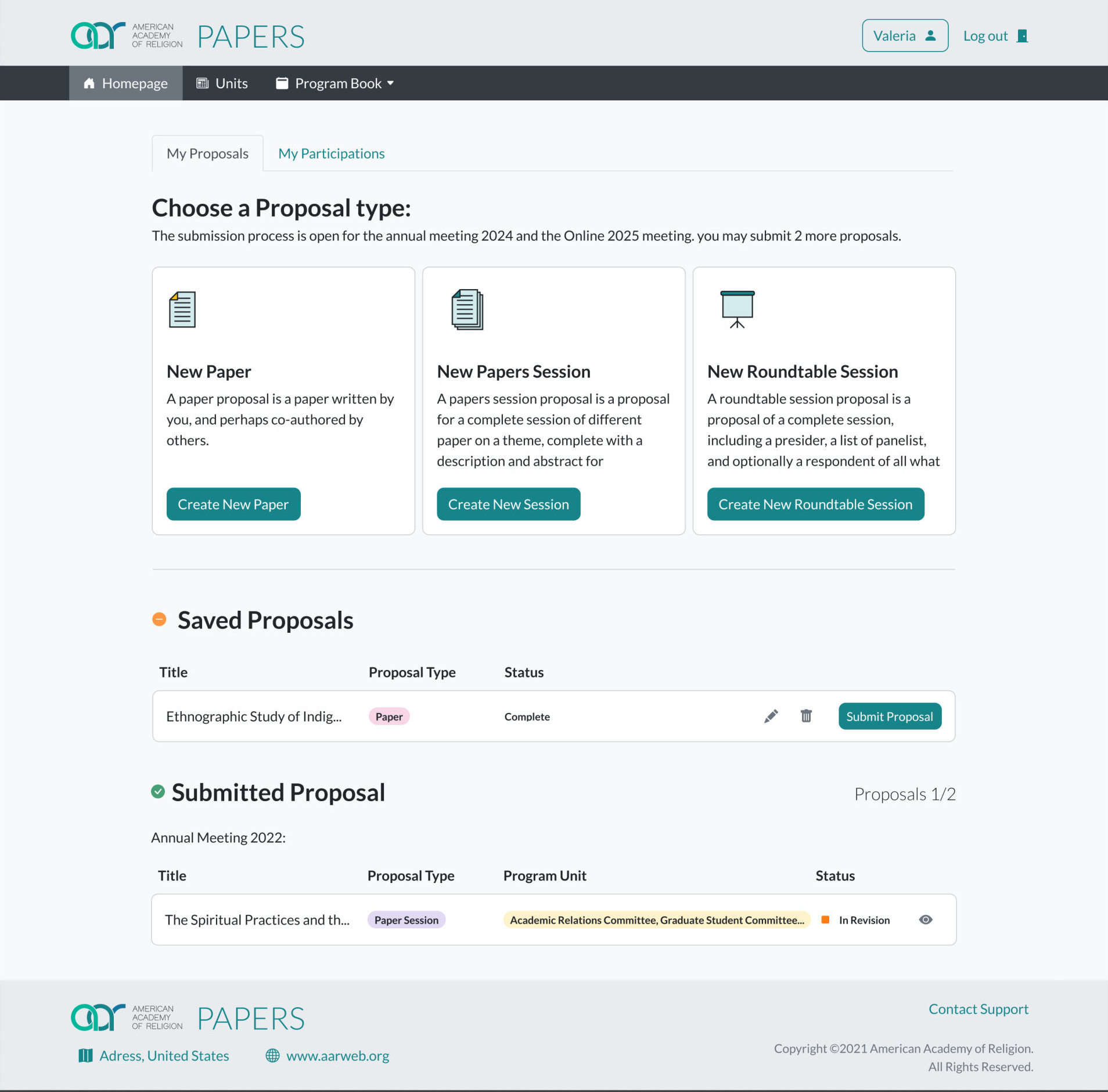
The three proposal types became side-by-side cards, each with an icon, a short description and one action, instead of three buttons separated by paragraphs.
Status at a glance
Proposals are grouped as saved and submitted, with badges for type and status and icon actions, in place of a plain table of text links.
Two views of your work
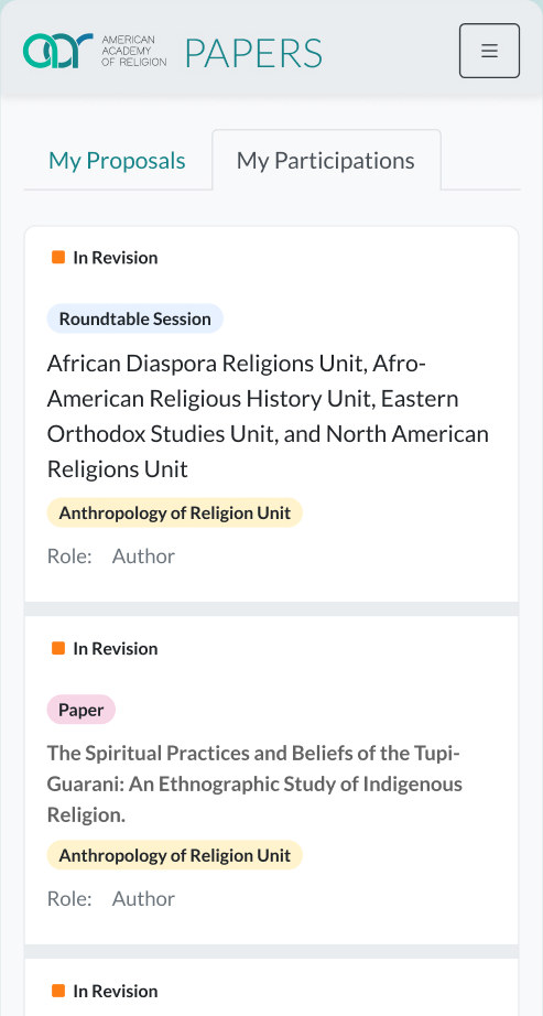
Tabs separate the proposals you own from the ones you take part in.
Inside Bootstrap 5
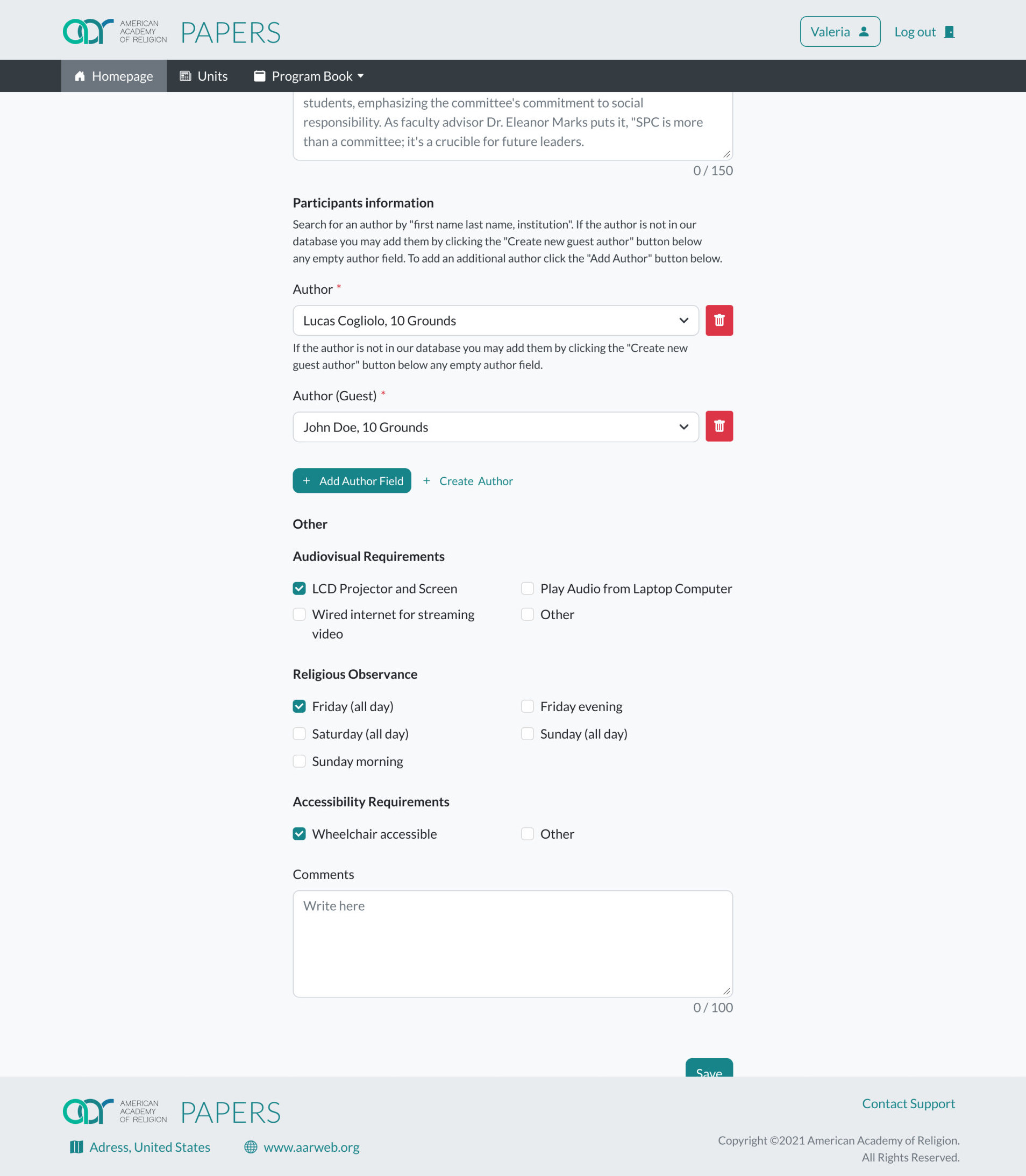
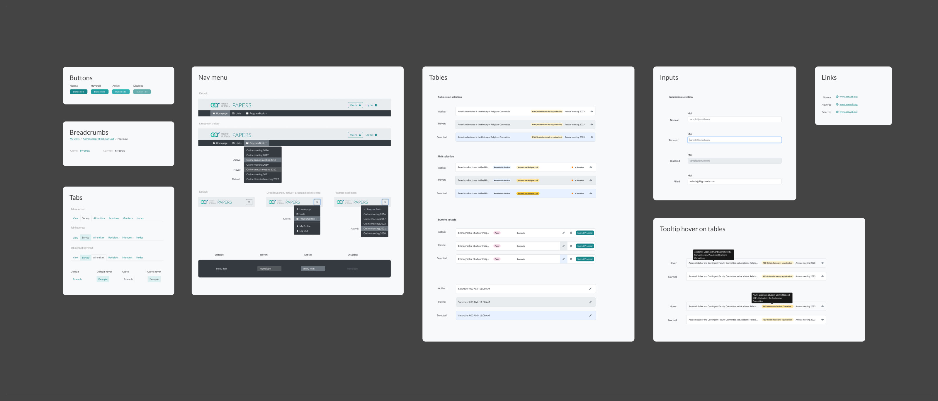
Every component is a Bootstrap 5 one with new color, spacing and type, so the redesign could be applied without rebuilding the front end.
Review in one place
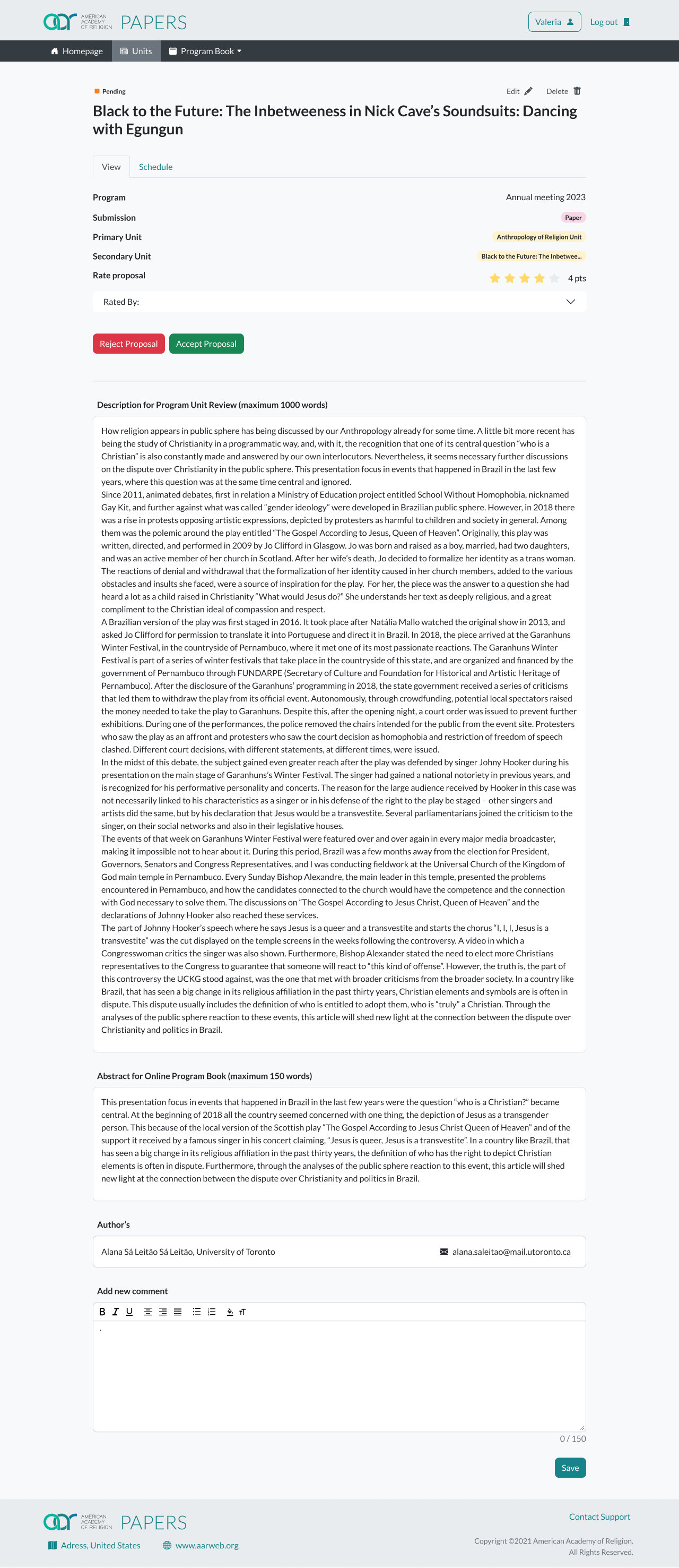
Chairs and steering members see their units and every proposal sent to them, with type, status and rating, and accept or reject from the proposal page.
Mobile, screen by screen
Forms, modals and lists were adapted one by one, so submitting a proposal from a phone is a full flow, not a squeezed desktop page.